
Central Maine Web
Web Design, Hosting, Search Engine Optimization
(207) 873-9321
Template-based Web Design & Portfolio
$500 One-time design fee / $330 annual hosting fee / $25 annual domain renewal fee
Your design will based on the template of your choosing, below. Some are mobile friendly, or "responsive", while others are designed for viewing on a PC or tablet. Non-responsive websites will still be viewable on smaller devices, like smartphones, but won't be as easy to navigate as the mobile friendly choices. Although your finished website will resemble the template that it's based on, we will of course use your logo, (which you must supply), and we can change the color scheme to suit your taste as well.
The process is simple:
Fill out the form, select your template and hosting package, and fill in any other instructions in the space provided on our order form below. Keep in mind this order form is nothing more than a way to get information to me directly and in an organized manner. I will be in touch with you to confirm and ask any questions shortly after you submit, so don't worry about making mistakes, or not putting enough information. We'll sort that all out before we begin.
Terminology:
- Responsive: Means that it will appear differently when viewed on a cellphone, tablet and PC. (Also referred to as "Mobile friendly").
- Vertical menu is side mounted, vertically, while horizontal menu goes from left to right, mounted at top (see samples below)
- Single-level menu means that there are no "sub menu" items that appear when you mouseover a menu item.
- Non-collapsable means that the menu remains open when viewed on a tablet or smartphone vs. collapsing to a typical "3 line" or stacked configuration

Here are samples of each template. If you'd like a better look, I can send you links to working samples of all the templates so you can navigate the links, and familiarize yourself with the look and feel of each.
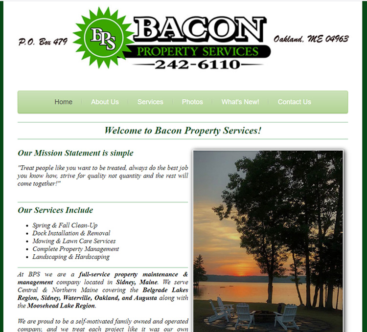
Template #1 - Responsive design, single-level, collapsable horizontal menu

Template #2 - Responsive design, single-level, non-collapsable vertical menu

Template #3 - Responsive design, multi-level horizontal collapsable menu
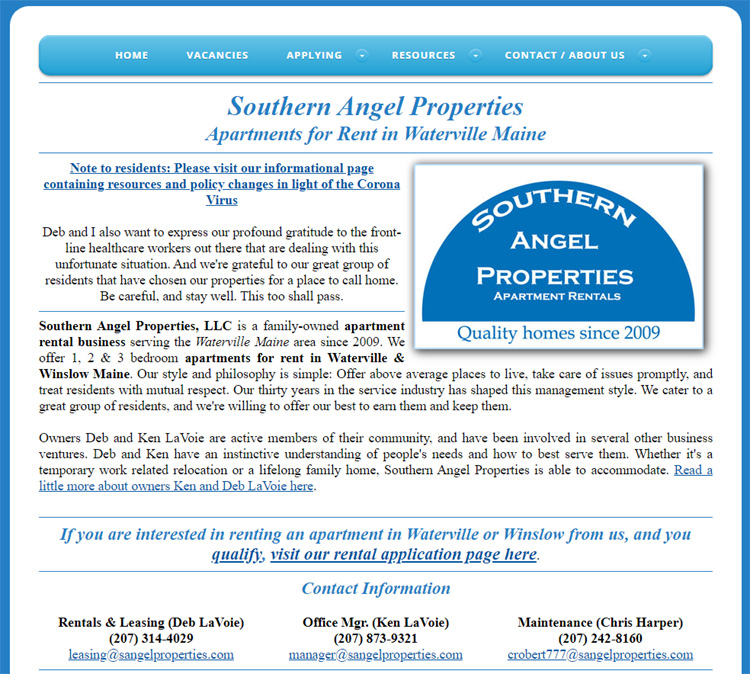
Template #4 - Responsive design, multi-level horizontal collapsable menu

Template #5 - Responsive design, multi-level, horizontal collapsable menu
View Live Site
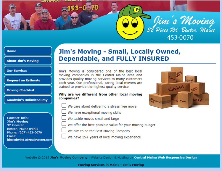
Template #6 - Responsive design, single-level, vertical non-collapsable menu

